Mamamade
BRAND IDENTITY / PACKAGING
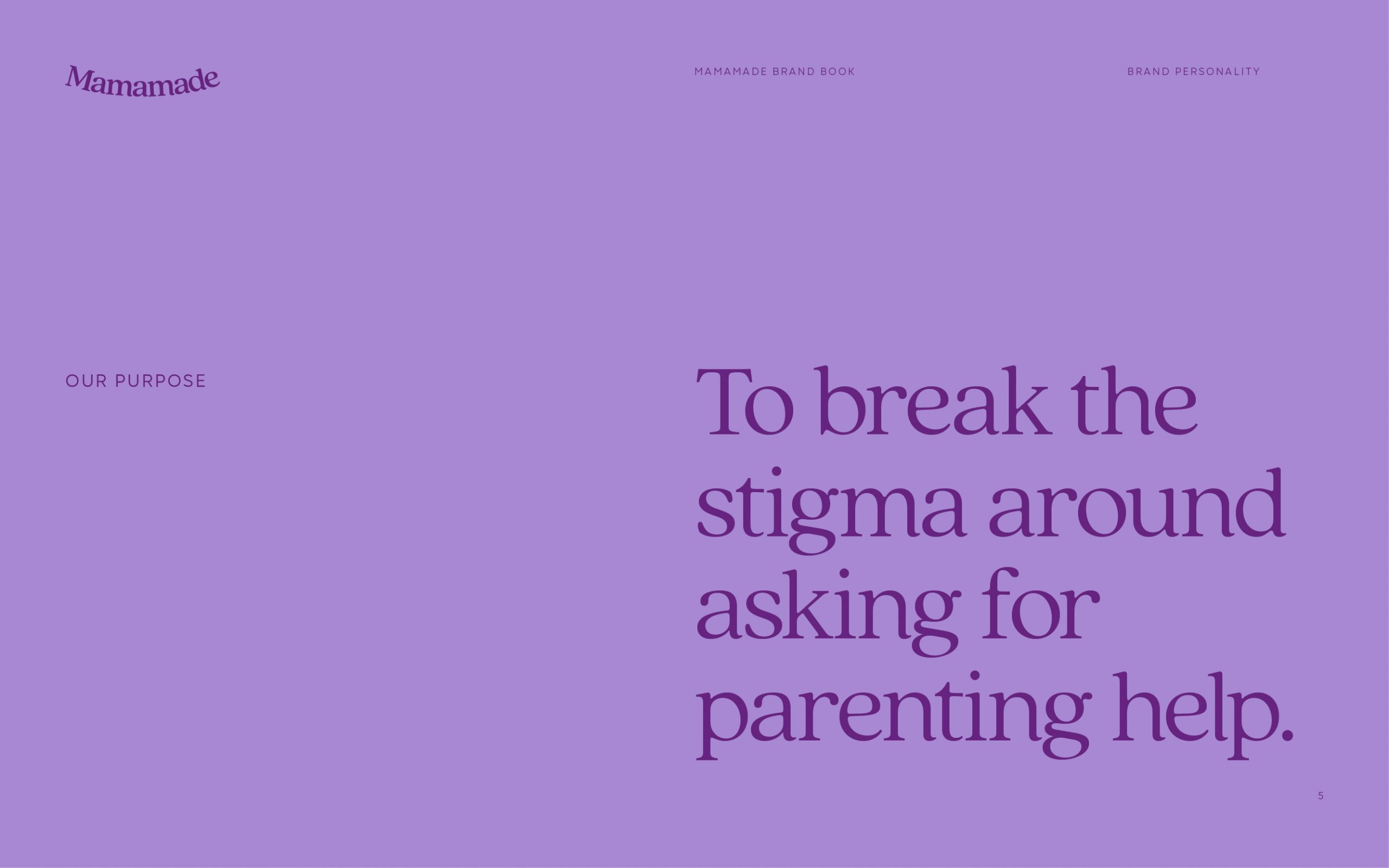
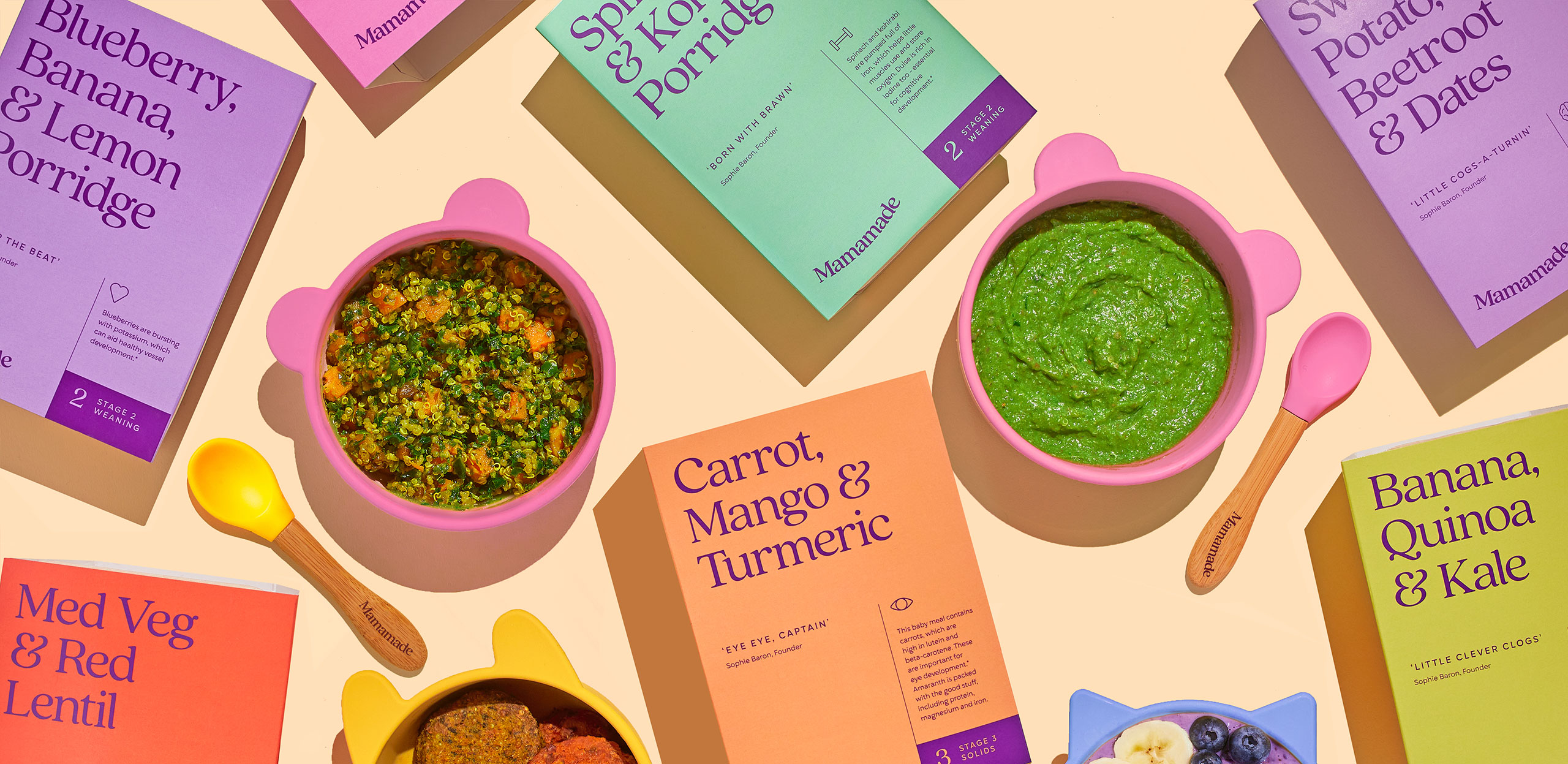
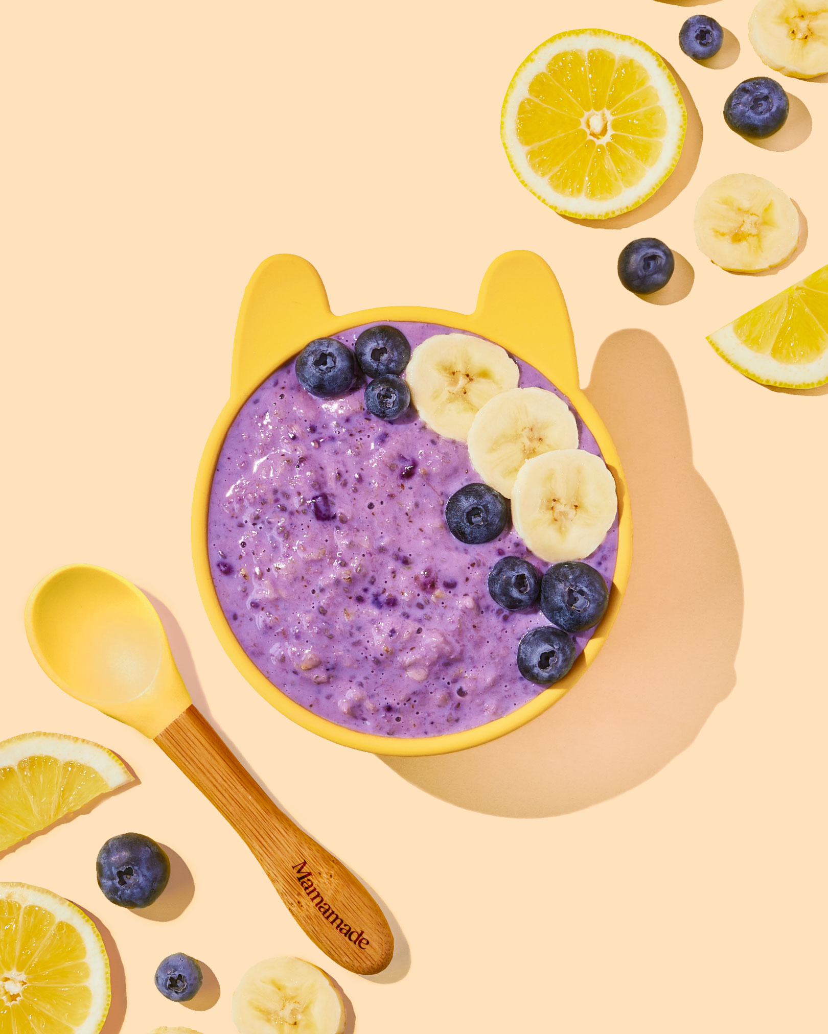
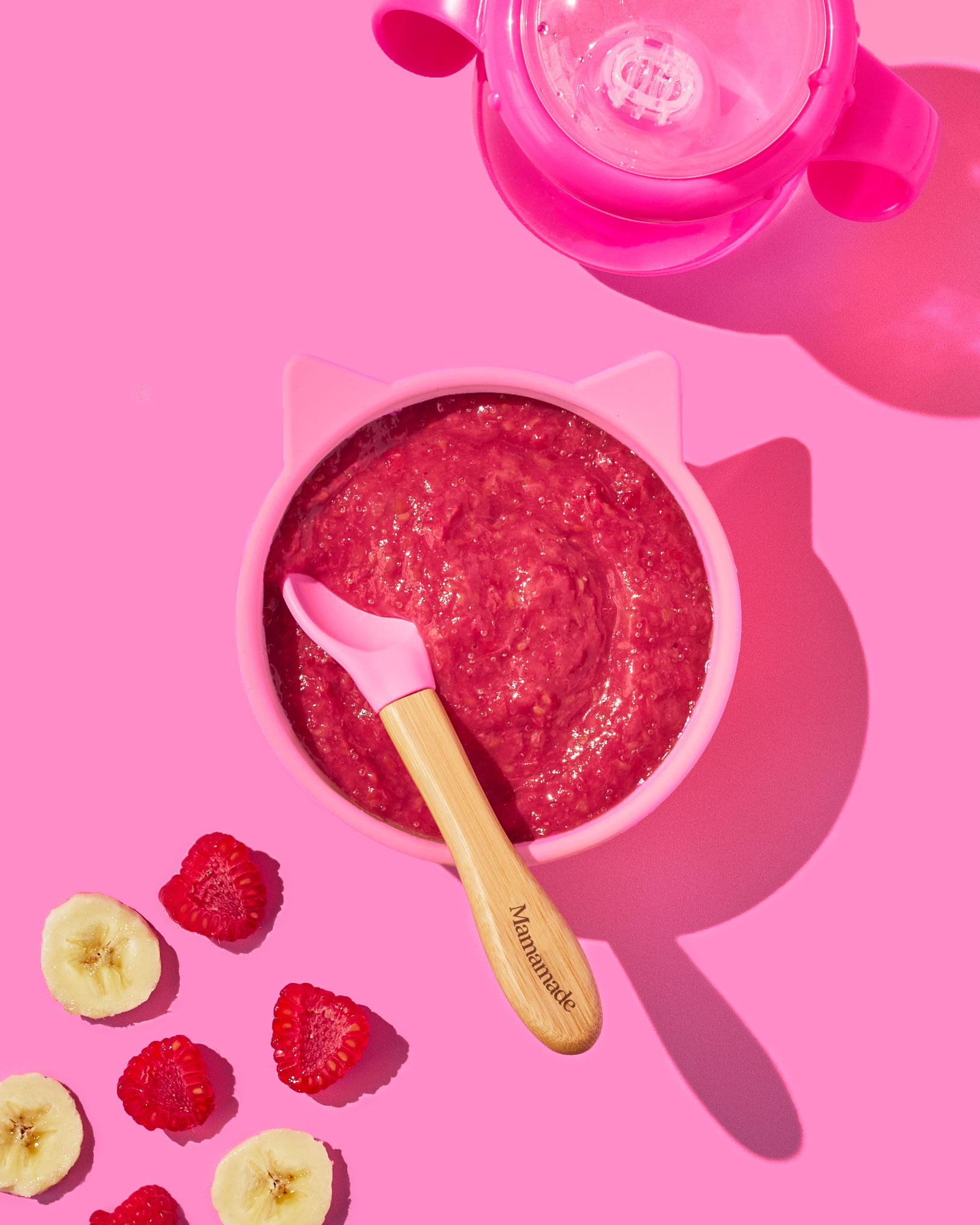
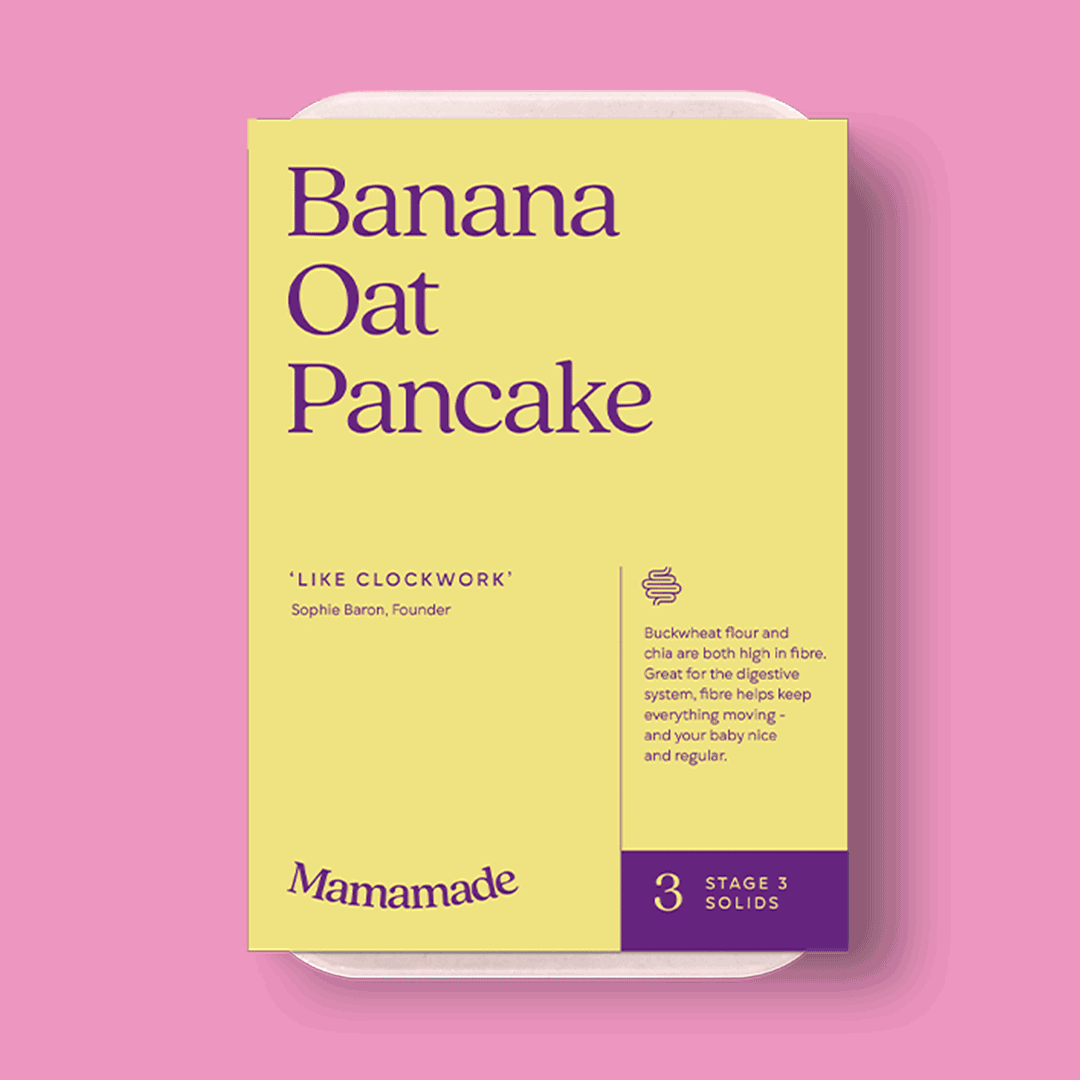
Plant-based baby food delivery service, Mamamade, were looking to reposition their brand and packaging to fit with the feeling of community that their brand had come to be known for. Not only is the food nutritionally informed, good for the planet and convenient but it also brings together a community of parents giving it their best shot (and not being ashamed to struggle along the way). With a couple of junior designers and a great copywriter, I formed a team that worked together to create a new brand identity and packaging design which highlights the health benefits and unites a family of new parents.
My role: Creative Director & Lead Designer
Agency: Childish Design | Photographer: Cara Cormack
THE BRAND CONCEPT
We made it
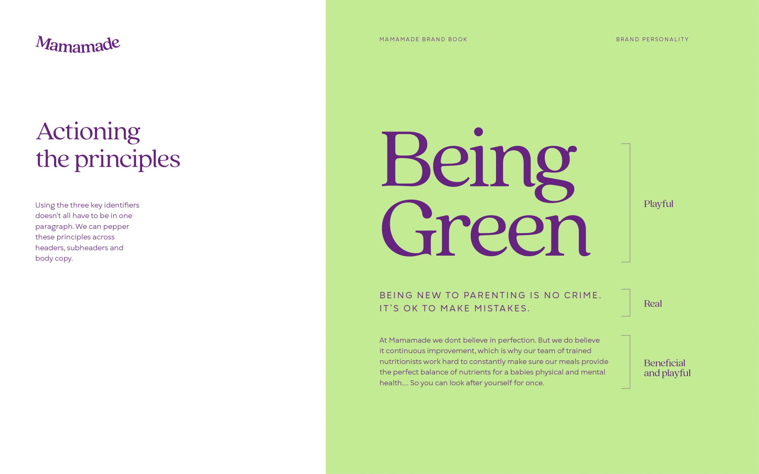
They say it takes a village to raise a child. But in a world where people don't know their next-door neighbor's name, we wanted to build a new village. A community of like-minded parents open to the struggle and sharing their experiences for the greater good. 'We made it' is all about togetherness as a community on a journey to healthier, happier families. The logo design was based around the idea of support to give a sense of togetherness and warmth within the parent community. The packaging designs were kept super simple to give the feeling of a methodical, easy journey for parents through the stages of weaning.
WHAT THE CLIENT SAID
"Thank you for all your work and
helping us create an amazing result"